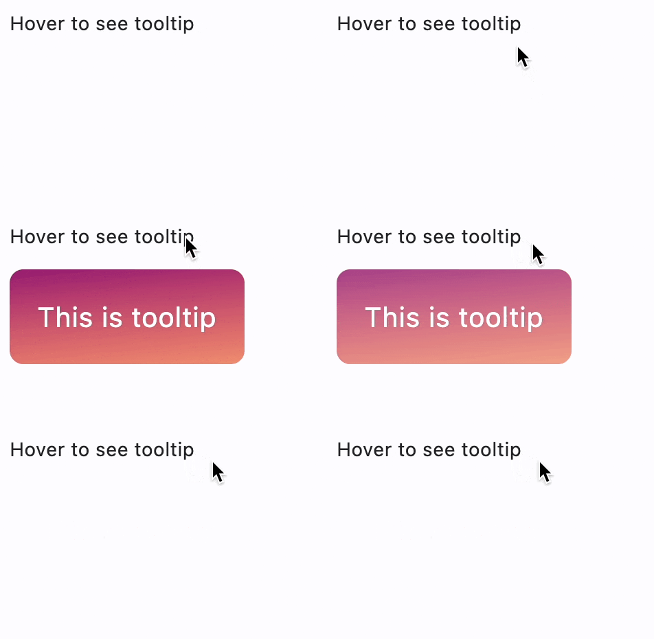
Tooltip
Provide text labels which help explain the function of a button or other user interface action.
Properties
bgcolor- Background color of the tooltip.decoration- The background decoration of this tooltip.enable_feedback- WhenTrue(default) the tooltip should provide acoustic and/or haptic feedback.exclude_from_semantics- Whether the tooltip's message should be excluded from the semantics tree.exit_duration- The length of time that the tooltip will be shown after a long press is released or a tap is released or mouse pointer exits the control.margin- The empty space that surrounds the tooltip.message- The text to display in this tooltip.mouse_cursor- The cursor for a mouse pointer when it enters or is hovering over the content.padding- The amount of space by which to inset the tooltip's content.prefer_below- Whether the tooltip defaults to being displayed below the control.show_duration- The length of time that the tooltip will be shown after a long press is released (if triggerMode isTooltipTriggerMode.LONG_PRESS) or a tap is released (if triggerMode isTooltipTriggerMode.TAP).size_constraints- Defines the constraints on the size of this tooltip.tap_to_dismiss- Whether the tooltip can be dismissed by tapping on it.text_align- How the message of the tooltip is aligned horizontally.text_style- TheTextStyleto use for the message of the tooltip.trigger_mode- The mode of the tooltip's trigger.vertical_offset- The vertical gap between the control and the displayed tooltip.wait_duration- The length of time, in milliseconds, that a pointer must hover over a tooltip's control before the tooltip will be shown.
Properties
bgcolorclass-attributeinstance-attribute
bgcolor: ColorValue | None = NoneBackground color of the tooltip.
decorationclass-attributeinstance-attribute
decoration: BoxDecoration | None = NoneThe background decoration of this tooltip.
If None, TooltipTheme.decoration is used.
If that is also None, a default decoration will be picked based
on the current theme mode:
In light theme mode:
ft.BoxDecoration(
    border_radius=ft.BorderRadius.all(4.0),
    bgcolor=ft.Colors.with_opacity(0.9, ft.Colors.GREY_700),
)
In dark theme mode:
ft.BoxDecoration(
    border_radius=ft.BorderRadius.all(4.0),
    bgcolor=ft.Colors.with_opacity(0.9, ft.Colors.WHITE),
)
enable_feedbackclass-attributeinstance-attribute
enable_feedback: bool | None = NoneWhen True (default) the tooltip should provide acoustic and/or haptic feedback.
For example, on Android a tap will produce a clicking sound and a long-press will produce a short vibration, when feedback is enabled.
exclude_from_semanticsclass-attributeinstance-attribute
exclude_from_semantics: bool | None = FalseWhether the tooltip's message should be excluded from the semantics tree.
exit_durationclass-attributeinstance-attribute
exit_duration: DurationValue | None = NoneThe length of time that the tooltip will be shown after a long press is released or a tap is released or mouse pointer exits the control.
If None, TooltipTheme.exit_duration is used.
If that's is also None, defaults to 0 milliseconds - no delay.
marginclass-attributeinstance-attribute
margin: MarginValue | None = NoneThe empty space that surrounds the tooltip.
If None, TooltipTheme.margin is used.
If that's is also None, defaults to Margin.all(0.0).
mouse_cursorclass-attributeinstance-attribute
mouse_cursor: MouseCursor | None = NoneThe cursor for a mouse pointer when it enters or is hovering over the content.
paddingclass-attributeinstance-attribute
padding: PaddingValue | None = NoneThe amount of space by which to inset the tooltip's content.
It has the following default values based on the current platform:
- On mobile platforms:
Padding.symmetric(horizontal=16.0, vertical=4.0) - On desktop platforms:
Padding.symmetric(horizontal=8.0, vertical=4.0)
prefer_belowclass-attributeinstance-attribute
prefer_below: bool | None = NoneWhether the tooltip defaults to being displayed below the control.
If there is insufficient space to display the tooltip in the preferred direction, the tooltip will be displayed in the opposite direction.
If None, TooltipTheme.prefer_below is used.
If that's is also None, defaults to True.
show_durationclass-attributeinstance-attribute
show_duration: DurationValue | None = NoneThe length of time that the tooltip will be shown after a long press is released (if triggerMode is TooltipTriggerMode.LONG_PRESS) or a tap is released (if triggerMode is TooltipTriggerMode.TAP).
This property does not affect mouse pointer devices.
If None, TooltipTheme.show_duration is used.
If that's is also None, defaults to 1.5 seconds for long press and tap released
size_constraintsclass-attributeinstance-attribute
size_constraints: BoxConstraints | None = NoneDefines the constraints on the size of this tooltip.
If None, TooltipTheme.size_constraints is used.
If that's is also None, then a default value will be picked
based on the current platform:
- on desktop platforms:
BoxConstraints(min_height=24.0) - on mobile platforms:
BoxConstraints(min_height=32.0)
tap_to_dismissclass-attributeinstance-attribute
tap_to_dismiss: bool = TrueWhether the tooltip can be dismissed by tapping on it.
text_alignclass-attributeinstance-attribute
text_align: TextAlign | None = NoneHow the message of the tooltip is aligned horizontally.
If None, TooltipTheme.text_align is used.
If that's is also None, defaults to TextAlign.START.
text_styleclass-attributeinstance-attribute
text_style: TextStyle | None = NoneThe TextStyle to use for the message of the tooltip.
trigger_modeclass-attributeinstance-attribute
trigger_mode: TooltipTriggerMode | None = NoneThe mode of the tooltip's trigger.
If None, TooltipTheme.trigger_mode is used.
If that's is also None, defaults to
TooltipTriggerMode.LONG_PRESS.
vertical_offsetclass-attributeinstance-attribute
vertical_offset: Number | None = NoneThe vertical gap between the control and the displayed tooltip.
When prefer_below is set to True
and tooltips have sufficient space to
display themselves, this property defines how much vertical space
tooltips will position themselves under their corresponding controls.
Otherwise, tooltips will position themselves above their corresponding
controls with the given offset.
wait_durationclass-attributeinstance-attribute
wait_duration: DurationValue | None = NoneThe length of time, in milliseconds, that a pointer must hover over a tooltip's control before the tooltip will be shown.
If None, TooltipTheme.wait_duration is used.
If that's is also None, defaults to 100 milliseconds.
Examples
Tooltip with decoration
import math

import flet as ft


def main(page: ft.Page):
    page.add(
        ft.SafeArea(
            content=ft.Column(
                controls=[
                    ft.Text(
                        "Hover to see the simple tooltip",
                        tooltip="This is a simple tooltip",
                    ),
                    ft.Text(
                        value="Hover to see the complex tooltip",
                        tooltip=ft.Tooltip(
                            message="This is a complex tooltip",
                            padding=20,
                            text_style=ft.TextStyle(size=20, color=ft.Colors.WHITE),
                            decoration=ft.BoxDecoration(
                                border_radius=10,
                                gradient=ft.LinearGradient(
                                    begin=ft.Alignment.TOP_LEFT,
                                    end=ft.Alignment(0.8, 1),
                                    tile_mode=ft.GradientTileMode.MIRROR,
                                    rotation=math.pi / 3,
                                    colors=[
                                        "0xff1f005c",
                                        "0xff5b0060",
                                        "0xff870160",
                                        "0xffac255e",
                                        "0xffca485c",
                                        "0xffe16b5c",
                                        "0xfff39060",
                                        "0xffffb56b",
                                    ],
                                ),
                            ),
                        ),
                    ),
                ],
            ),
        )
    )


if __name__ == "__main__":
    ft.run(main)